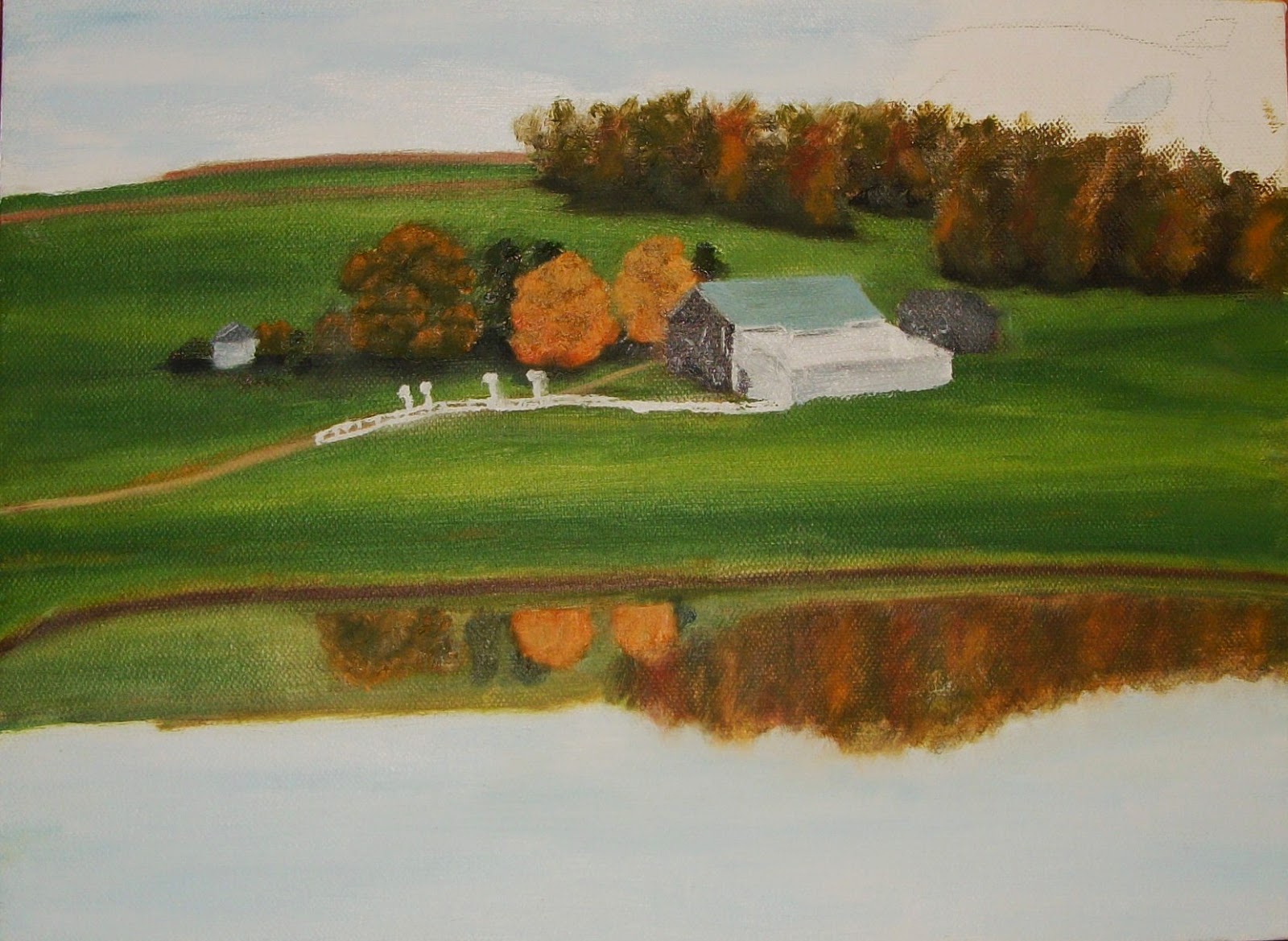
Only the best from a bulletin board full of experience in such varied interests as poultry, art, good food, and Ohio history.
Come along on the adventure!

Be sure to also check out ohloveofgeocaching.com for travel and caching adventures!
Showing posts with label Artist's Gallery. Show all posts

Friday, November 20, 2015

Farm of the Past

Artist's Gallery
The Old Barn
And now, a final poem I wrote last summer:

Farm of the Past

Surrounded by a surging sea of grain
The old farm, near deserted, stands alone;
Its silos rise like beacons o'er the plain
To hail once more the harvest season come.

The length'ning shadows of the setting sun
Fall softly on the quiet, rugged barn,
Whose rafters echo yet with lowing calls
Of milking cattle from those days long gone.

The sparrows dart to nests beneath the eaves,
Hard-working tools and rusty wagons rest;
Old musty bales of straw lie in the loft,
While memories of the farmer’s work creep past:
The empty cattle walk and milking stalls,
The barnyard overgrown with thorns and sticks,
Rough fences, iron gates, and on the wall,
A license plate from 1966.
 
The silos flank the barn like sentries tall,
Their worn stone walls have sheltered years of grain;
Strong pulleys, iron rods, and rusty pipes
May never handle fodder corn again.
 
How has the small-time farmer’s work been lost?
The harvest’s precious, priceless product gold?
Has industry completely swept the field
Of tractors, haystacks, milking herds of old?
 
Gone are the family farm work, faith, reward,
Though harvest time continues year by year;
Only the empty barns and tools preserve
The farmer’s hard-worked livelihood so dear.

Sunday, April 19, 2015

Pink Orchid

Artist's Gallery
Pencil Pinks
Last of all we have another pencil drawing of a flower. This beautiful pink orchid was also a get-well card. The background, of course, is the natural paper white, accented by a brilliant yellow chain I drew around the card's perimeter. The flower itself is created by the interaction of different shades of pink and red, just as in the original photo below. I used only four or five different pencil shades to achieve my colors, but produced an amazing range from shocking pink to deep magenta. I carefully left the edges of the petals with a tiny rim of white to give definition. The yellow accent in the center gives a nice highlight, blending into orange and finally into the pink of the flower. Believe it or not, the original photo is also mine, taken at Franklin Park Conservatory's annual orchid display. The verse, which continued onto the inside, seemed to fit perfectly with the flower:
For He shall give His angels charge over you,
To keep you in all your ways.
In their hands they shall bear you up,
Lest you dash your foot against a stone.
                                                             Psalm 91:11-12

Friday, April 17, 2015

Wild Iris

Artist's Gallery
Yellow Jewel
This little yellow iris was a treasure find at John Bryan State Park. When my dad and I hiked the trails along the Little Miami River several years ago, there were not many flowers blooming. This wild iris stood all alone in a field of green. Stooping down to get a picture, I almost fell into a bed of poison ivy. But it was worth it. I copied the photo for this card to send to a friend who was ill. The leaves range in color from sea green to black, giving a strong illusion of depth. They appear scribbled at close inspection, oddly producing the effect of a wild sea of green surrounding the little jewel. The vibrant yellows stand in sharp contrast to the striking maroon markings on the iris. I have never seen one again quite like it.

Tuesday, April 14, 2015

Spring Bouquets

Artist's Gallery
Daffodils of the Rainbow
These colorful bouquets were done in colored pencil. I painstakingly layered each different area of color with a dark shade for the shadows, a medium shade for the actual color, and a light shade for the highlights. Then I would move on to the next color area and repeat the process. Once again, all the flowers came from a bulb catalog - where else can you find so many types of daffodils? My favorite was the white daffodil with a pink center, although I also like how the white one on the left with the multicolored center came out. The blue bow was fun to draw and sets them off nicely. But I most enjoyed coloring the bows on the envelope and then lifting the flap to split them in half!
As for the flowers below, they are either peonies or oversized begonias, I am not sure. The colors certainly came out vividly - just look at that shockingly pink ribbon. The delicate clumps of daisies set everything off nicely. I think this one looks a little more real than the top one. Both drawings, which are 5x7 cards by the way, made lovely gifts to send to my pen friends in Germany and Austria.
Pink Bouquet

Sunday, April 12, 2015

Sunflower Revisited

Artist's Gallery
Barns and Sunflower
Speaking of sunflowers, here is yet another rendering of that cheerful sunflower picture. This one could almost pass for watercolor, as the acrylic has such a translucent quality. I do think I overdid the color intensities a little bit, but it was a hurried painting. I like how the leaves almost seem to vibrate, the colors are so intense. But compare it to my original sunflower painting here and you will see the differences. My sister and I actually grew this sunflower in our yard a couple years ago - it got over four feet tall I think. I took the photo with the barns in the background, and I don't even know how many times I have painted it since. You can click here to see three of them, each in a different medium. I guess this is a hard picture to get tired of.

Thursday, April 9, 2015

Sunflowers

Artist's Gallery
Sunflower Bouquet
Here is another pencil drawing with a different subject. These cheerful sunflowers seem to be smiling out of the picture. I drew them on a sympathy card for a family friend more than five years ago now. I believe all the sunflowers came out of a seed catalog. I took the little pictures of the different varieties of sunflowers in the seed listings, and pieced them together to make a bouquet. I like the assortment of reds, oranges, and yellows I came up with - some with black centers, some with brown. Look more closely and you might also notice the many shades of green in the background leaves. This technique increases the impression of variety in the yellows even more. I remember I was not very happy with this drawing when I finished it, but looking at it now I do think it came out nicely.

Tuesday, April 7, 2015

Bluebird House

Artist's Gallery
Pencil Bluebird
This little bluebird is done in pencil rather than acrylic. The process is very different, to say the least. Rather than building up layers, each part of the picture is filled in separately. For the background, I colored a number of different greens and then blended them together with white pencil overtop. The birdhouse was done in a similar manner, except I tried to create a wood grain effect with straight, parallel lines. If you look closely you might be surprised at some of the colors in the roof - I don't know where I got the notion of using red and blue! The bluebird was fun to draw with its beautiful shades of blue, blending into the orange and white breast. My favorite part, though, is the little opening heart on the birdhouse. I think this would be a lovely place for a bird to live.

Saturday, April 4, 2015

Meadowlarks

Artist's Gallery
Blue Meadowlark
Let's continue our celebration of spring with a few more songbirds. Did you notice something interesting about these two birds? Maybe they are identical? Actually, they are! I found the picture of this meadowlark in a magazine and liked it so much, I painted it twice. I think the painting on the card above came first; I love the watercolor look of the bird's breast and the background. The shading on everything came out so nicely, though the highlights maybe not so much. I also really like the look on the back of the card (it's the left-hand portion of the photo above), with its blended, watery look. The blue adds a nice contrast to the yellows of the bird.
 
The card below, on the other hand, matches the magazine picture more closely. The marbled green background was a challenge to create, but also fun. I started with different shades of piney green, and added some very yellow and blue greens to give contrast. The bird and fence are not painted in as much detail, but seem brighter and more full of motion. The grasses in front add to the liveliness. I think you could about hear this bird warble from looking at the painting!
Green Meadowlark


Thursday, April 2, 2015

Spring Birds

Artist's Gallery
Birds & Daffodils
And now it's time to celebrate the long-awaited arrival of spring! I think the birds above are doing just that. I painted this little picture as a 5x7 greeting card, using acrylic paint. I was so proud of it that I kept it a long time before sending it to my German pen friend. I copied all the different varieties of daffodils from a bulb catalog, while the birds themselves were found in a bird field guide. I believe they are indigo buntings, with possibly some color enhancement here and there. I made the mistake of painting the brick wall after I had painted the daffodils. It made for a pain-staking operation as well as blotchy look in the end! But I actually sort of like the effect (now that the painting part is over). I have always enjoyed painting birds, especially blue ones.

Sunday, August 10, 2014

Pond Trio

Artist's Gallery
A Trio of Three Ponds
Interestingly enough, both of my oil paintings are not displayed together in my house. Mud Valley Reflections joined a number of my Amish country paintings in our living room (Walk in Mud Valley, The Way Home, and Walking Home). On the other hand, Fish Pond Shed found its place in the kitchen in an interesting trio of paintings. It matched my painting Water Lily Lake nicely: though the ponds are different, the colors are the same. I also had another small painting of the same pond as in Fish Pond Shed. You can see it up close below. It was a bit challenging to fit such a horizontal scene into a vertical frame! I really like how the light in the sky and water came out though. And the ripples in the pond - those are especially pretty I think. The farm and shed, well, they're decent enough. Anyway, this painting completed the trio nicely. I was happy to be done with those messy oil paints!
Fish Pond Study

Friday, August 8, 2014

Fish Pond Shed 2

Artist's Gallery
Final Touches
After a little bit more work, my second oil painting was finally finished. Did you think everything was complete on the building in my last picture? Look again. For some reason, I forgot to paint the porch roof post shadows at the same time as the rest of the shading on the building! Well, I had to mix up more paint (which does not exactly match) and put those shadows in. In fact, I still forgot to put them in on the building in the reflection! Oh, well. Then I added some more highlights in the trees, and also along the pond edge. The yellow ochre on the bushes around the pond ties in with the field and adds some interest. I'm actually pretty happy with how it came out.

Wednesday, August 6, 2014

Fish Pond Shed 1

  Artists Gallery
Beginning
Encouraged by the relative success of my first painting in oils, I embarked on another. At this point I was actually taking a class every week in oil painting. So I chose a pretty ambitious picture to try. This scene is actually from the same set of fish ponds, and focuses on the little white shed where the fish keeper stored his fish supplies and feed. For whatever reason, I did not take any pictures until this stage, probably the third layer of oils.

I began with light blue sky, repeated in the water but going down into a deeper blue. The trees were a background of mahogany browns, highlighted in an almost purplish-red on the tree tops. The grass, in turn, came out a range of ochre-tinted greens, with a plain ochre strip midway back. This made for a very interesting combination of colors in the painting, one which I was not too thrilled with. But my art teacher seemed to be happy with the bold use of color, and I went on a painted in the shed. Getting those rooflines straight was something else.

Sunday, August 3, 2014

Mud Valley Reflections 4

Artist's Gallery
Finished Painting
Now for the finishing touches. I was itching to paint the red tree leaves in the front, but I knew I had to completely finish the rest of the painting first. If anything behind was still wet, the tree leaves would get muddy and smudged. First I added a few more highlights on the trees and grass, as well as their corresponding reflections. Next came the cows - and they were not easy to create. Some of them ended up looking more like train cars than four-legged animals! After making sure that was dry, I started in on the tree. It was really challenging since I knew that once I put the paint down, it would be really hard to remove it again! I built up the leaves with dark reds and maroons, then added brighter brick red on top. I think the red tree adds a nice frame on the picture without being too intense for the scene. See what you think of it compared to my watercolor of the same scene right here.

Friday, August 1, 2014

Mud Valley Reflections 3

Artist's Gallery
Adding Detail
After applying that previous layer of paint, I had to wait for it to dry. In contrast to fast-drying acrylic paints (literally five minutes), oils are incredibly slow. I mean, depending on the thickness and type of paint, oils can take from two days to a week to dry completely. It's definitely not a project for an afternoon sitting! While this is a benefit for blending and what not, it can test your patience as you wait to continue the painting. The messy factor can also be an issue, especially if you have to transport the wet painting home in a car! Well, my paint was dry within a week, and I prepared to add more detail to my painting. The barns were done in a grayscale from black to white, with the characteristic blue-green roof. The fence and tiny martin houses were even more difficult, given that I did not have a thin enough brush. They came out in that inexact, country style.

Wednesday, July 30, 2014

Mud Valley Reflections 2

Artist's Gallery
Second Layer
After the first wash of oils had dried, I was ready to continue. I mixed full-strength oils in bolder colors to apply over the corresponding areas of the wash. The grass came out in smooth, brilliant shades of green, and the sky was a mixture of white and light blue. The trees, on the other hand, needed more texture. I loaded a scruffy-type brush with several shades of paint and dabbed it on, blending the leaves into the sky at the top. This is the beauty of oils: because they dry very slowly, you can accomplish a lot more blending. I could paint the sky and half an hour later still blend the tree leaves into it. You can especially see this effect in the grass. I think this blending ability produces a more professional, uniform painting in the end. Another benefit of oils is the brilliant, lasting colors that can be achieved. Acrylics just aren't as glossy, pigmented, or rich.

Monday, July 28, 2014

Mud Valley Reflections 1

Artist's Gallery
Beginning in Oils
Here is the beginning of another painting. Only this time, it's not the same old acrylic paint to which I am so loyal. After much persuasive talk from various artist acquaintances, I finally gave in and decided to try painting in oils. It's much more complicated than it sounds. I pretty much had to buy a whole new set of art supplies: oil paints (of course), paint brushes with oil-resistant glue holding the bristles in, and oil-quality canvas that wouldn't dissolve or become brittle under the oil chemicals. And instead of rinsing my brushes with water, I needed a special turpentine solution that would remove the oily paints. After cleaning my brushes, all the dirty paper towels had to be burned to prevent spontaneous combustion, and wet painting carefully transported home. I soon concluded that oils were, in a word, very messy. But still worth a try.
 
So here we go. To begin, I "watered" the paint down using a special thinner for oils, and applied a wash to cover the entire canvas. I tried to get the light and dark tones placed correctly, even if the colors were a bit off. This is based off a photograph, which I actually used for a watercolor a while back. You can check it out right here, and compare as the painting progresses.

Saturday, April 19, 2014

Spring Bridge

Artist's Gallery
Spring Run Wild
 My last greeting card is another cheery spring scene. It was one of those leftover paint jobs as well--definitely blue and white run wild! I used a number of scrubby brush strokes to create all the trees, and used such brilliant oranges, yellows, and purples that I had to tone it down with white. At first it seemed it was going to be a fall scene, but I decided to make those brilliant colors into buds instead of leaves. And then the seeming blobs of red and blue in the grass are nice suggestions of tulips and hyacinths. The little white bridge and bench seem to add a personal touch--a much-needed calming effect. This would be perfect for any spring birthday or anniversary.

Thursday, April 17, 2014

Birdhouse Card

Artist's Gallery
Bird Bath, Bird House
Pleased with my success on the first try, I attempted another painted card for a second pen friend. This one was a blue and yellow scene. After sketching in a brilliant blue sky and animated grasses, I nestled forget-me-nots into the greenery. I loaded the brush with various shades of brown to get the wood-grain look of the birdhouse, and then used a blend of the same browns for the fountain. It was fun to paint the water in the fountain, although it ended up looking more like an overflowing bucket of paint!
The birds were a bit difficult, but came out decently enough, though I've never actually seen any completely yellow birds! On this one, I used the same yellow paint to write my pen friend's name (rather than calligraphy pen), and then added color-coordinated plastic hearts again. I really like the free-handed look of the painting, with so many different colors each remaining a bit distinct. And best of all, it was so much fun to create!
 

Tuesday, April 15, 2014

Waterfall Card

Artist's Gallery
Spring Waterfall
Tired of painting greeting cards, I began to look for other ways to create a gift from a painting. The waterfall above was part of a sort of greeting card/postcard combination for one of my pen friends. For this one, I chose a sort of mottled, parchment-look card stock that I wanted to show through on the finished painting. I started with a pile of rocks and ran a waterfall down the front. Then I searched a flower seed catalog for suitable flowers to surround it. I don't know if the blossoms I used are actually a real type of flower, but they do look like trilliums turned pink and yellow. Once that was all dry, I used a calligraphy pen to write my pen pal's name in fancy lettering, and added a couple thin plastic hearts as embellishments. I was really pleased with it! It made a lovely gift one step up from a greeting card.

Saturday, April 12, 2014

Cosmos Card

Artist's Gallery
Summer Farm
Now we move into summertime with another cheerful scene. The corn is tasseling and the summer flowers are in peak bloom. This scene came straight from my front yard, with the old barn and silos in the background. I used a liquid acrylic wash to paint the sky, grass, and barns and let it all dry. Then I used thick paint straight from the tube to create the bright spots of color in the foreground. This painting was a greeting card, but looks almost identical to a framed painting I had done a while before called "Summer Afternoon." You can check it out here. They're both the same size but I think this one has brighter colors.